On this page:
General layout patterns
In general the layout patterns favoured by our website precedents and the group of tools we have developed is a liquid layout, from top to bottom, centered around headings and paragraphs. These are punctuated with sidebars and imageboxes, often staggered between left and right. This layout pattern works because it is simple, flexible and adaptable. It accomodates various browser window sizes by re-adjusting block elements, notably text containers, on changes to the window width.
An alternate layout approach is the storyboard layout with blocks stacked left to right, and top to bottom, in a more or less fixed layout. This is not as natural in this environment, but can be accomplished through the use of our custom block level elements, or using class and style modifiers on the generic div element.
The bicolumn pattern is a condensed layout pattern used for example in our announcement pages (Latest News, Coming Events, Neighbourhood News all available from the home page). This pattern involves a smaller font, and a liquid layout in each of the two columns.
The objectives of any layout are to
- Allow the user to scan the first appearance (top) of the page quickly, to comprehend the general contents, and the options available, to quickly make a decision as to stay or go, and where to navigate.
- Allow the user to quickly navigate to a desired location on the current page, or to quickly scan the page for relevance and interest. Aids in rapid scanning include tables of contents, short meaningful titles, descriptive sidebars, and interesting pictures.
- Provide clear and accessible navigation options to investigate topics of interest further, or to identify and navigate to related topics.
Any number of hybrids is possilble. Try to keep it simple.
Liquid layout
In a liquid layout, floating elements such as sidebars and imageboxes move with the side of the browser window, and text wraps around them. As the browser window changes size, spanning elements such as paragraphs change in width, and re-render their content to adjust to the size of the window and the placement of surrounding floating elements.
The following list gives sections in the order that they are often used in layouts, with brief definitions. They can be considered as standard optional selections of cascading sections for a liquid layout page:
- Questions/Comments?
- A sidebar inviting the user to click on an email address to contact the Friends of Dufferin Grove Park. We use this somewhat sparingly, typically on the main page of a department or major topical section for which we have defined one or more dedicated email addresses.
- Welcome...
- A brief section that orients the user with respect to the material on the page and related page. Used primarily for main pages that act as "gateways" to related pages.
- On this page:
- A table of contents for the current page. Each list item is clickable and takes the reader to the heading of the selected content section on the current page.
- Related pages:
- A list of pages that are related in a lateral and general kind of way to the current page. The page is introduced with a short paragraph that is typically either a "teaser" extract from the introduction from the beginning of the page, or an italicized list of table of content items that effectively give an overview of what's on the page. The goal is to give the reader an opportunity to quickly and effectively assess the interest and relevance of the related page.
- (High Priority Topical page access section)
- This is similar to related pages, but much more tightly and specifically defined through a heading, and typically much more tightly related to the topic of the current page, often in an hierarchical fashion. That is the topical page is some sub-section, or some critical bacgrounder to the current page. High priority topical related pages often would be on the current page were it not for the fact that the length of the current page would become excessive.
- (Content sections)
- This is the content presented in sufficent depth and with sufficient structure to provide a learning experience for the reader.
- (Low Priority Topical page access section)
- This is similar to the High priority related pages, but the material may be somewhat dated, or more tangientially involved.
- (History/archive page access sections)
- This is often material from newsletters, or archived dated material from the current page that has been removed to but maintained in "side" pages for historical or contextual interest.
In conjunction with these we sometimes use sidebars (including menucolumn sidebars) for archive access, and for newspaper clipping access.
The exact classification and structural presentation of content is a matter of judgement and experience, and often more difficult and time consuming than the technical layout and rendering. We find it is often fitting to modify page layouts based on reflection and feedback.
HTML pattern: liquid layout
<div class="sidebar-right-medium">
<p class="compact">
<span class="heading-inline">
Questions? Comments? Want to get involved?
</span> Contact:
<a href="mailto:webmaster@dufferinpark.ca">
webmaster@dufferinpark.ca
</a>
</p>
</div>
<h3 class="section-divider-high">Welcome to the pattern pages</h3>
<p>(a few short paragraphs of orientation material)</p>
<h3 class="section-divider-high">On this page:</h3>
<ul class="contents">
<li><a href="#relatedpages">Related pages</a></li>
<li><a href="#somesection">Some section</a></li>
<li><a href="#someothersection">Some other section</a></li>
</ul>
<a name="relatedpages"></a>
<h3 class="section-divider-high">Related pages:</h3>
<dl class="contents">
<dt><a href="somepage.html">First related page</a><dt>
<dd>
<i>First content item; Second content item.</i>
<a href="somepage.html">Read more >></a>
</dd>
...
</dl>
<a name="somesection"></a>
<h3 class="section-divider-high">Some section</h3>
...
Storyboard layout
Storyboard layout can use stacked sidebars:
HTML pattern: storyboard layout, sidebars
<div class="sidebar-left-narrow" style="width:200px;height:100px">
 <h6 class="heading-emphatic">Panel 1</h6>
 <p>Some content</p>
</div>
<div class="sidebar-left-narrow" style="width:200px;height:100px">
 <h6 class="heading-emphatic">Panel 2</h6>
 <p>Some content</p>
</div>
<div class="sidebar-left-narrow" style="width:200px;height:100px">
 <h6 class="heading-emphatic">Panel 3</h6>
 <p>Some content</p>
</div>

<div class="block-divider"></div>

<div class="sidebar-left-narrow" style="width:200px;height:100px">
 <h6 class="heading-emphatic">Panel 4</h6>
 <p>Some content</p>
</div>
<div class="sidebar-left-narrow" style="width:200px;height:100px">
 <h6 class="heading-emphatic">Panel 5</h6>
 <p>Some content</p>
</div>
<div class="sidebar-left-narrow" style="width:200px;height:100px">
 <h6 class="heading-emphatic">Panel 6</h6>
 <p>Some content</p>
</div>
Storyboard layout can also use stacked imageboxes:
Panel 1
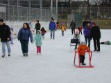
Skating
Some narrative
Panel 2
Skating
Some narrative
Panel 3
Skating
Some narrative
Panel 4
Skating
Some narrative
Panel 5
Skating
Some narrative
Panel 6
Skating
Some narrative
HTML pattern: storyboard layout, imageboxes
<div class="imagebox-left" style="width:200px;height:200px">
 <h6 class="heading-dark">Panel 1</h6>
 <img class="image-bordered" src="photos/DufferinRink_tm.jpg" alt="">
 <h6 class="heading-dark">Skating</h6>
 <p class="compact">Some narrative</p>
</div>
<div class="imagebox-left" style="width:200px;height:200px">
 <h6 class="heading-dark">Panel 2</h6>
 <img class="image-bordered" src="photos/DufferinRink_tm.jpg" alt="">
 <h6 class="heading-dark">Skating</h6>
 <p class="compact">Some narrative</p>
</div>
<div class="imagebox-left" style="width:200px;height:200px">
 <h6 class="heading-dark">Panel 3</h6>
 <img class="image-bordered" src="photos/DufferinRink_tm.jpg" alt="">
 <h6 class="heading-dark">Skating</h6>
 <p class="compact">Some narrative</p>
</div>

<div class="block-divider"></div>

<div class="imagebox-left" style="width:200px;height:200px">
 <h6 class="heading-dark">Panel 4</h6>
 <img class="image-bordered" src="photos/DufferinRink_tm.jpg" alt="">
 <h6 class="heading-dark">Skating</h6>
 <p class="compact">Some narrative</p>
</div>
<div class="imagebox-left" style="width:200px;height:200px">
 <h6 class="heading-dark">Panel 5</h6>
 <img class="image-bordered" src="photos/DufferinRink_tm.jpg" alt="">
 <h6 class="heading-dark">Skating</h6>
 <p class="compact">Some narrative</p>
</div>
<div class="imagebox-left" style="width:200px;height:200px">
 <h6 class="heading-dark">Panel 6</h6>
 <img class="image-bordered" src="photos/DufferinRink_tm.jpg" alt="">
 <h6 class="heading-dark">Skating</h6>
 <p class="compact">Some narrative</p>
</div>
Or storyboard layout can use generic containers (divs):
HTML pattern: storyboard layout, generic containers (divs)
<div class="float-left border-narrow padding-narrow
 margin-right-narrow margin-bottom-narrow"
 style="width:200px;height:200px;background-color:olive">
 <h6 class="heading-dark">Panel 1</h6>
 <p>Some content</p>
</div>
<div class="float-left border-narrow padding-narrow
 margin-right-narrow margin-bottom-narrow"
 style="width:200px;height:200px;background-color:aqua">
 <h6 class="heading-dark">Panel 2</h6>
 <p>Some content</p>
</div>
<div class="float-left border-narrow padding-narrow
 margin-right-narrow margin-bottom-narrow"
 style="width:200px;height:200px;background-color:green">
 <h6 class="heading-dark">Panel 3</h6>
 <p>Some content</p>
</div>

<div class="block-divider"></div>

<div class="float-left border-narrow padding-narrow
 margin-right-narrow margin-bottom-narrow"
 style="width:200px;height:200px;background-color:fuchsia">
 <h6 class="heading-dark">Panel 4</h6>
 <p>Some content</p>
</div>
<div class="float-left border-narrow padding-narrow
 margin-right-narrow margin-bottom-narrow"
 style="width:200px;height:200px;background-color:lime">
 <h6 class="heading-dark">Panel 5</h6>
 <p>Some content</p>
</div>
<div class="float-left border-narrow padding-narrow
 margin-right-narrow margin-bottom-narrow"
 style="width:200px;height:200px;background-color:maroon">
 <h6 class="heading-dark">Panel 6</h6>
 <p>Some content</p>
</div>
Of course storyboard layout can be a combination of all three forms.
Panel 2
Skating
Some narrative
Panel 4
Skating
Some narrative
HTML pattern: storyboard layout, hybrid
<div class="sidebar-left-narrow" style="width:200px;height:200px">
 <h6 class="heading-emphatic">Panel 1</h6>
 <p>Some content</p>
</div>
<div class="imagebox-left" style="width:200px;height:200px">
 <h6 class="heading-dark">Panel 2</h6>
 <img class="image-bordered" src="photos/DufferinRink_tm.jpg" alt="">
 <h6 class="heading-dark">Skating</h6>
 <p class="compact">Some narrative</p>
</div>
<div class="float-left border-narrow padding-narrow
 margin-right-narrow margin-bottom-narrow"
 style="width:200px;height:200px;background-color:green">
 <h6 class="heading-dark">Panel 3</h6>
 <p>Some content</p>
</div>

<div class="block-divider"></div>

<div class="imagebox-left" style="width:200px;height:200px">
 <h6 class="heading-dark">Panel 4</h6>
 <img class="image-bordered" src="photos/DufferinRink_tm.jpg" alt="">
 <h6 class="heading-dark">Skating</h6>
 <p class="compact">Some narrative</p>
</div>
<div class="float-left border-narrow padding-narrow
 margin-right-narrow margin-bottom-narrow"
 style="width:200px;height:200px;background-color:lime">
 <h6 class="heading-dark">Panel 5</h6>
 <p>Some content</p>
</div>
<div class="sidebar-left-narrow" style="width:200px;height:200px">
 <h6 class="heading-emphatic">Panel 6</h6>
 <p>Some content</p>
</div>
Bicolumn layout
For bicolumn layout patterns examine the bicolumn section of Custom block level elements page, and the source code of the announcement pages from the home page.